Information architecture deliverables: Wireframes (with pictures)
It’s good to know what information architecture deliverables you can expect on a project. Whether you’re working on a website, intranet, or another content management system implementation or redesign, there’s a few usual suspects for information architecture deliverables:
Card sorting
Content model or metadata model
Wireframes
This article looks at wireframes.
Wireframes
Wireframes are typically a low-fidelity representation of the navigation, structure, and page layout of your site. They are typically drawn up from an end-user perspective. For someone visiting the site, what will it look like? Wireframes are first and foremost a communication tool to agree to how a redesigned site should be laid out. They don’t need to be true to every last detail. They only need to have enough information to communicate and answer questions for visual designers, developers, and stakeholders.
What do wireframes show?
The wireframes that I’ve made have varying levels of fidelity, but at a minimum they show:
The global navigation and local navigation
The home page layout, a landing page layout, and a content page layout
Layouts for other content types (such as events, news, or any other specialty layout)
Placeholders for images and text
As wireframes get into greater detail, they can show detail such as:
Representative text
Calls to action
How interactions work, such as how the global and local navigation works
How do you make wireframes?
Depending on what my client needs, I’ve made wireframes in different tools. If we need something basic, I’ve used Balsamiq or Google Draw. If we need something more advanced, I would use Axure or Figma.
How do you collaborate on wireframe design?
How I collaborate on wireframe design really depends on how much time I have for the project, the level of involvement of my client, and the level of design knowledge. The wireframes I work on are for content-heavy sites and there isn’t typically a huge variation in how these sites look. To collaborate, I have done all of the following depending on my client’s needs and interests:
Created wireframes then taken feedback
Listed out the elements we want on certain pages with the client, then made the wireframes, then taken feedback
Facilitated co-design sessions
What do you need to start wireframes?
Before creating wireframes, I make sure these elements are already complete. They take the guesswork out of some aspects of the wireframes and the wireframing process goes faster.
Personas list the user’s top tasks and topics as well as the business’s goals for the user
The content strategy lists the guidelines and any content requirements
The site map provides the page structure which informs the global and local navigation as well as the related content
Content models tell me what metadata and on-page content is available for the different types of pages
Page flows have also defined any navigation requirements
How do you know if wireframes are “right”?
When making wireframes, I review them repeatedly with my client including the core project team and various stakeholders. If it’s in scope, I would build out a low-fidelity prototype and test it with users.
Who should review wireframes?
The core team, plus any key stakeholders, should review the wireframes. Note that not everyone is a designer, so not all feedback will be useful. It’s important for me to frame the discussion and the type of feedback I will take and address.
What do you do once wireframes are done?
Once wireframes are done, you can move on to visual design and developing the layouts in the content management system. As mentioned above, I might also do a prototype and user testing.
Do you need to keep updating the wireframes?
Wireframes are a tool to communicate layout and content design and interaction. Once you have these things built out in a content management system, there’s no need to keep updating the wireframes.
Do you need “real” content in wireframes?
I have done wireframes with Lorem Ipsum placeholder text, with real text, and with placeholder boxes. Here’s my take on these options:
I think Lorem Ipsum is the least useful. It’s hard for clients to imagine what is supposed to be in that box.
Having real content on all the pages is really useful, but this takes longer and invites feedback not only on the site structure and layout but also on the content itself. Wireframes aren’t meant as a content review tool so I would stay away from real content unless it’s already been edited.
Having headings on pages is really useful. It helps clients see how the elements have been prioritized.
Having a home page with real life headings as well as which elements will be placed where is really great. I find clients are the most focused on the home page layout.
Having a mixture of real headings with placeholder boxes for content and images should give a good idea of how the site will be laid out and the priority of elements.
Wireframe examples
I’ll share some samples from my past work with notes on why I made them. As I was looking up these wireframes from the my way way back machine (aka my external hard drive - yes I have one of those!), I thought that some of them look dated. So I decided to update the wireframes according to more “modern” UI design standards.
These samples are all for information-heavy sites, sometimes for websites and sometimes for intranets. These sites are more about information seeking, browsing, filtering, and searching for content items. Most of my samples are not from eCommerce because I don’t work in that domain.
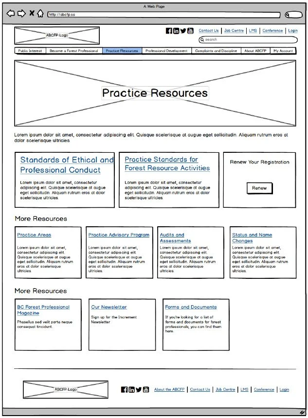
Forest Professionals of BC
For FPBC, we had discussed what content we needed on each page. While the content had not yet been rewritten, I had the titles and some of the body text. These wireframes didn’t need to be high fidelity or interactive as they would only be used for more thorough visual design work and for the writer to create the content. The navigation functionality was already well defined and would be further explored in the visual design phase.
In the images below, from left to right, you’ll see the home page, a level 1 landing page, another level 1 landing page, and then a level 2 landing page. The level two landing page has a similar layout to the level 1 landing page and includes the addition of the left hand navigation.


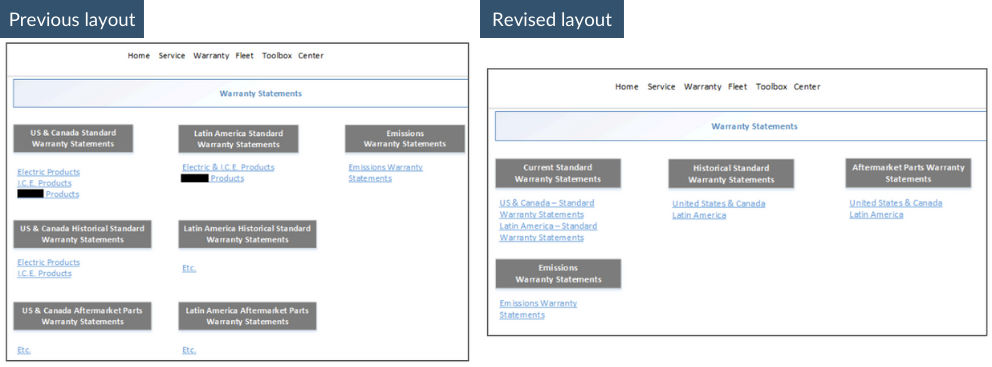
Product Manufacturer (Anon)
Not every wireframe needs to be revolutionary or a wholesale redesign of the site. This can be particularly true of an intranet or extranet where the content creator’s web design skills might be introductory and not advanced. Remember that wireframes are a communication tool to show how things can be organized or structured differently.
For one client, they grouped their warranty statements by geography and currency and type of warranty. In other words, they combined these three different aspects to create narrow section headings. For example, they had section headings for:
US and Canada current warranties
Latin American current warranties
EMEA current warranties
Africa and Middle East current warranties
Asia current warranties
US and Canada historical warranties
Latin American historical warranties
EMEA historical warranties
Africa and Middle East historical warranties
Asia historical warranties
Plus all the other types of warranty documents
Instead of structuring this particular page in this way, it would be more effective to structure by either by geography or currency or type of warranty. In the picture below, I suggested they group by currency and then type of warranty. It may not seem like a huge change. It’s more about educating these content creators on different ways to group their content.
Rocky View County
For these wireframes, they needed to be interactive to show how the navigation should work and how users could click through the site. It wasn’t a very “content-forward” project so these wireframes really focus on the structure and not much on what the site should say.
Looking back, the home page was pretty sparce in terms of content. Plus it uses some now out-of-date UI elements. It was fun to look at this old wireframe and imagine how I would design it now.
Here’s a side by side view of the original wireframe and an update I made based on more current trends and layouts. If I did this today, I would:
Focus on one hero item, not four. Because carousels are outdated.
Feature the search box more prominently. Having looked at other city and county websites, this seems to be the trend.
Provide space for 4 trending items below the search. This replaces the carousel in the hero area.
Make the page longer. Scrolling is now du jour.
Allow for more news items. It would include more images, too.
Provide a newsletter signup. This is also a trend with other city and county websites.
